Making quick interactive plots with Chart.js
Frontend
I had a need in one of my projects to create an dynamic plot. So I started to explore a popular library, d3, but immediately got overwhelmed. While it is very flexible and powerful, I quickly realized that it has a steep learning curve. I may dig into it at some point in the future but right now I was looking for a simple way to create line plot. My quest led me to Chart.js. It fit my bill - simple but I was pleasently surprised to find that it was also responsive right out of the box.
So how do I create a plot?
It is indeed simple - you create a new chart using new Chart() with two arguments. First argument is the handle on <canvas> element in your html file in which the plot will be placed. Second argument is an object with first key as type of the plot, second key of data which is an object containing datasets (an array of data objects). Let's see the steps in detail:
- Add the library in html's head:
<head>
    ...
    <script src="https://cdnjs.cloudflare.com/ajax/libs/Chart.js/2.9.3/Chart.min.js"></script>
    ...
</head>
- Add a
<canvas>element inside html's body:
    ...
    <canvas id="myChart"></canvas>
    ...
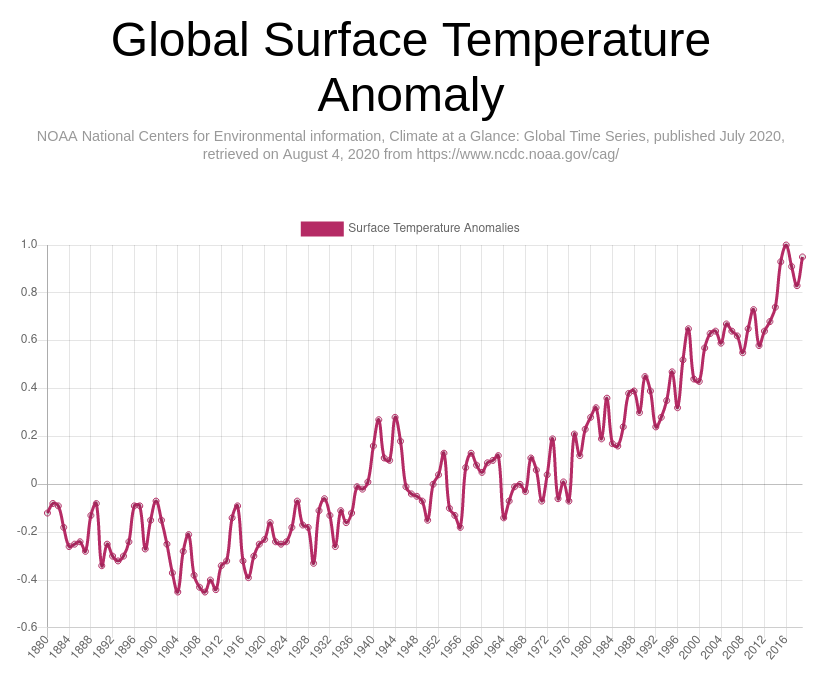
- Get some data to plot. I found this json data on global surface temperature anomalies. I don't know yet how to bring it using JavaScript so I simply copied it and parsed inside the file.
- Then we parse the x and y data for our plot into arrays using
Object.keysandObject.valuesfunctions. - Finally we create the chart using
new Chartpassing the canvas handle and the data object to it.
const data =
JSON.parse('{"description":{"title":"Global Land and Ocean Temperature Anomalies, ...}}');
const years = Object.keys(data.data);
const anomalies = Object.values(data.data);
// create a canvas handle
const ctx = document.getElementById("myChart");
// create the chart
let myChart = new Chart(ctx, {
    type: "line",
    data: {
        // array of labels
        labels: years,
        datasets: [
            {
                // array of data
                data: anomalies,
                borderColor: "#b52b65",
                fill: false,
                label: "Surface Temperature Anomalies"
            }
        ]
    }
})
Neat huh!