Using media queries to aid responsiveness
Thursday, Jul 30, 2020
Frontend
Frontend
Media queries are an effective way to adapt the content layout based on the device being used to view the content. Syntax is simple:
@media (condition) {
    ...
}
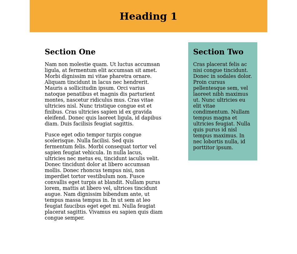
Let's see how a two-column content shows up on a large screen and small screen without any media queries:
Large screen (950 px)
Small screen (600 px)
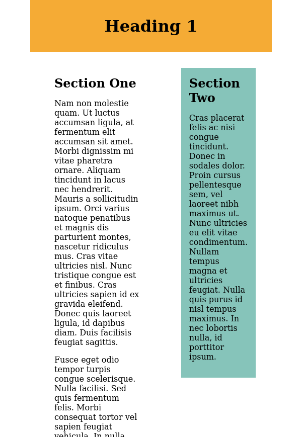
Clearly the two-column layout starts to get less readable as we go narrower on the screen width. Now let's add the following code, which will change the flex-direction to column and the width of each column to 90% if the screen width is less than 675 px:
@media (max-width: 675px) {
    .cols {
        flex-direction: column;
    }
    .col-1,
    .col-2 {
        width: 90%;
    }
}
Small screen (600 px) after adding the media query
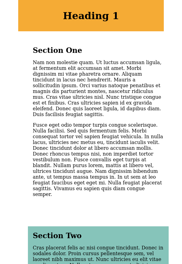
Sweet!