Designing navbar layout with flexbox
Wednesday, Jul 29, 2020
Frontend
Frontend
Let's see how flexbox layout can accomplish a reasonably clean and responsive header with navbar. We will start with the following html:
<!DOCTYPE html>
<html>
    <head>
        <meta charset="UTF-8">
        <title>navbar</title>
        <link href="styles.css" rel="stylesheet">
    </head>
    <body>
        <header> <!-- width spans the entire screen -->
            <div class="container container-nav">
                <div class="logo">
                    <h1 class="title">Awesome Title</h1>
                    <p class="subtitle">This is about awesome title</p>
                </div>
                <nav>
                    <ul>
                        <li><a href="#">Home</a></li>
                        <li><a href="#">Books</a></li>
                        <li><a href="#">About</a></li>
                    </ul>
                </nav>
            </div>
        </header>
    </body>
</html>
So here is the div structure and approach:
- links are inside nav div implemented with
<ul>tag. Since ul and li are block level elements by default, we can implement flexbox on ul to make li tags horizontal. - h1 and p will be part of logo div
- both logo and nav div are wrapped inside container-nav div so that another flexbox can be implemented on the container-nav to place logo on the left and nav on the right.
- container class can be used to implement styles that may be common with other containers, for example
widthandmargins.
barebones html

container is centered with responsive width
body {
    margin: 0;
}

/* top-level div */
header {
    background: #e3dfc8;
}

.container {
    max-width: 900px;
    width: 80%;
    margin: 0 auto;
}

container-nav converted to flex and padding is applied
.container-nav {
    display: flex;
    padding: 2em;
    justify-content: space-between;
}
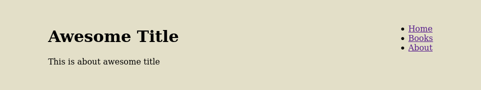
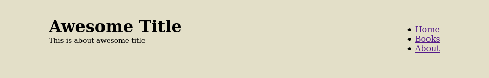
h1 and p moved close to each other to give a logo feel
.container-nav p {
    font-size: 0.85rem;
}

.container-nav h1,
.container-nav p {
    margin: 0;
    }
ul converted to flex, li items spaced out and links text decoration removed
nav ul {
    display: flex;
    list-style: none;
    padding: 0;
    justify-content: center;
}

nav li {
    margin-left: 2em;
}

nav a {
    text-decoration: none;
    color: #1f4068;
}