Controlling whitespace around flexbox items
Wednesday, Jul 29, 2020
Frontend
Frontend
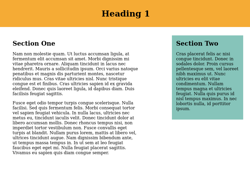
Earlier we briefly looked at how flexbox can be used to create multiple column layout. Now we want to go a step further and see how white space around items can be controlled to create a nicer looking layout. When div's display is set to flex, it lines up its children elements along main axis (horizontal). In the example below, both section one and two have a parent div with class “cols”, each section has a common class “col” and has an individual class “col-2” and “col-1” respectively. So the following css produces the layout below (padding/margin code for body, h1 and h2 is not shown for clarity):
.cols {
    display: flex;
}

.col-1 {
    background: #86c4ba;
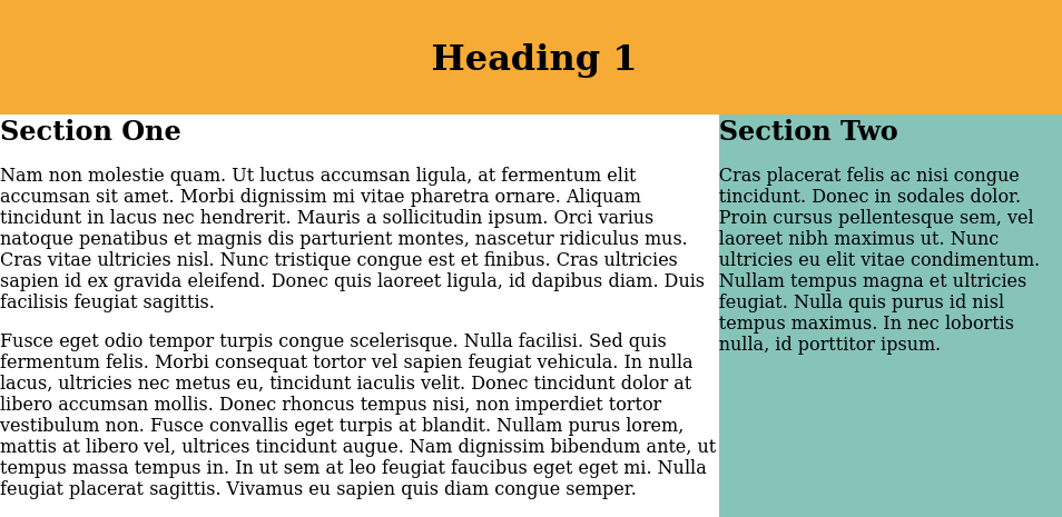
We will do the following to manage the whitespace around both sections:
- Set
widthof each element explicitly such that the total width is less than 100%. Below, we set section one's width to be 50% and section two to be 25%. - Distribute the remaining whitespace (25%) between the elements using
justify-content: space-between;. This will stack first element all the way to the left and the last element all the way to the right while 25% is split evenly between the elements. - We do'nt want to stretch section two's height to match section one. We do this by
align-items: flex-start. - Add some margin and padding to each item. So we get
.cols {
    display: flex;
    justify-content: space-between;
    align-items: flex-start;
}

.col {
    padding: 1em;
    margin: 2em;
}

.col-1 {
    width: 25%;
    background: #86c4ba;
}

.col-2 {
    width: 50%;
}