Starting to think responsively
Tuesday, Jul 28, 2020
Frontend
Frontend
Responsiveness is a term used in CSS when you try to make the content adapt to various screen sizes (mobile, tablets, desktops etc). There are many ways to design the page responsively but it turns out there are some easy strategies to get started.
Think in terms of relative sizes
When the length/size is defined in relative units, the container automatically adapts to the screen size:
- Define width of the container in
%units. This will control the width as some fraction of the parent element. - Define paddings and margins in
emunits. This will be relative to the font size defined for that element. - Specify font size in
remunit.remdefines size relative to the font size of the root element, which is<html>element. - Set
max-widthon containers so they do not expand too much for wider screens - Always set
widthfor the images. Since images areinlineelements by default, in the example below, we have specified width of image element to be 100%.
To illustrate (and start my new project), I created this simple html for a running newsletter. All main divs (header, image, main and footer) have a container class associated with them. Let's look at the page below that uses the following css properties:
CSS
body {
    margin: 0; /* remove default margins */
}

.container {
    margin: 0 auto; /* center all containers */
    width: 80%; /* responsive width of containers: % is wrt parent's width*/
    max-width: 720px; /* do not go above certain pixels wide */
    padding: 1em; /* relative to font-size of container */
}

img {
    width: 100%; /* to contain the image within its parent instead of original size */
}
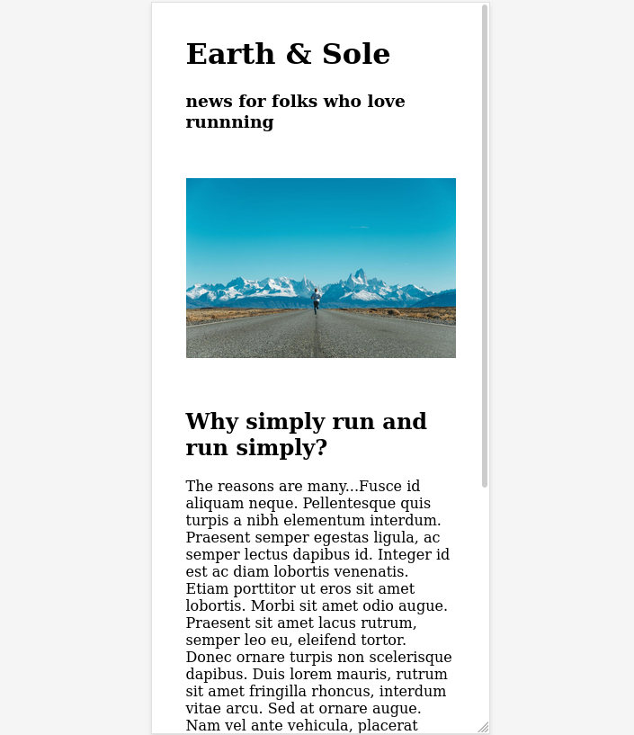
How it looks on a wide screen
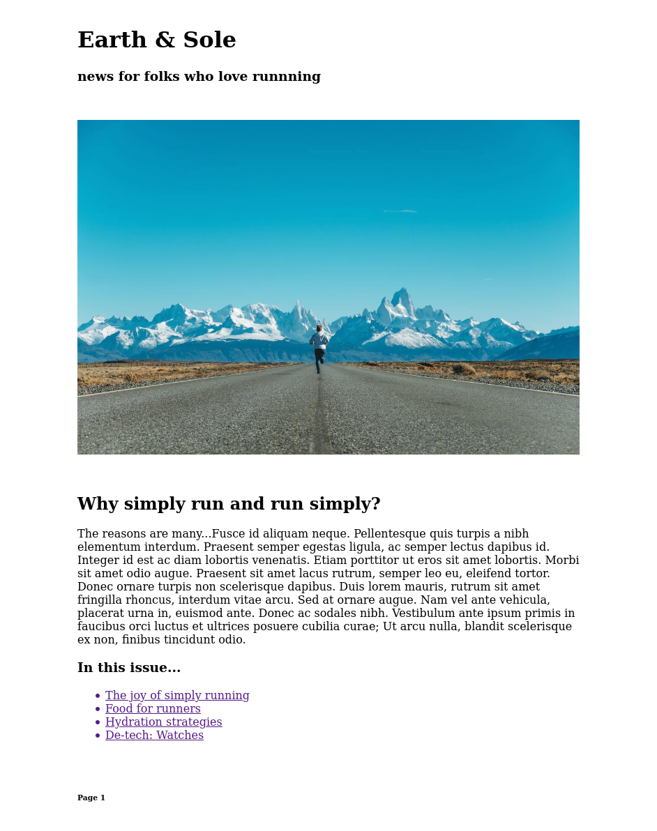
How it looks on a narrow (375 px) screen