Create multi-column layout using CSS Flexbox
Saturday, Jul 11, 2020
Frontend
Frontend
In the past, multi-column layouts relied on float-clear tricks. I don't know much but they say the method was a bit hacky. Flexbox aims to manage multi-column layout more intuitively. I gave it a try and it's pretty neat. Here is demo of barebones usage:
- wrap the content of each column in individual container
- wrap all those containers in another container
- for this parent container, set
display: flex;and you are good to go! - in the example below,
justify-content: space-aroundis used to evenly space the columns
HTML
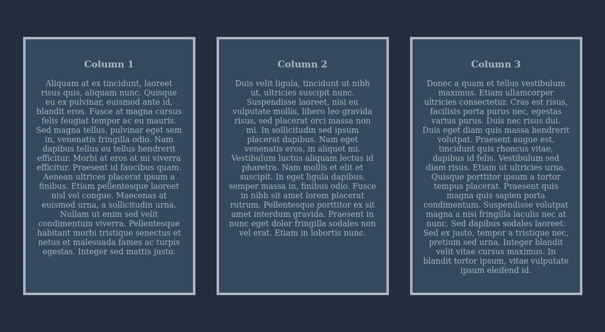
<div class="cols">

    <div class="col">
        <h3>Column 1</h3>
        <p>Aliquam at ex tincidunt, ...</p>
    </div>

    <div class="col">
        <h3>Column 2</h3>
        <p>Duis velit ligula, ...</p>
    </div>

    <div class="col">
        <h3>Column 3</h3>
        <p>Donec a quam et ...</p>
    </div>

</div>
CSS
body {
    margin: 0;
}

.cols {
    display: flex;
    justify-content: space-around;
    background-color: #212f3c;
    padding: 75px 25px;
    text-align: center;
}

.col {
    width: 300px;
    border: 5px solid #aeb6bf;
    padding: 20px;
    background-color:  #34495e;
    color: #aeb6bf;
}
This is how it looks: